Being Creative: Judith & Gordon's Wedding Card
I quite often try to make cards for special occasions, rather than buying them. Often the commercially made cards are just nasty and I can't find anything I can bear to buy, but more importantly, I think it's a nice personal touch. However, I am disgustingly lazy and only occasionally favoured with suitable inspiration and ability, so I do buy cards quite often. Don't be offended if you're reading this and haven't got a custom card from me, hey, believe me, it's no special privilege.
For the occasion of my dear friend Judith's wedding to Gordon, I did get inspired. As part of my big holiday in Europe I spent a few days with Judith in Glasgow, Scotland. I had a great time with her, she kindly took the time to be a tourist guide for me. We also spent some time discussing wedding details because I was there a little over a month before The Big Day. Unfortunately, Gordon was out of town. Jude was quite keen to hand-write guest's names on small place cards for the dinner tables. She had in mind some kind of calligraphy. One day we picked up a few "calligraphy pens" (basically chisel-tipped felt pens), she already had a few library books out on the subject so we spent an evening experimenting. It was quite time consuming and perhaps impractical, we talked of perhaps using a printer and a suitable font, but as I write this I don't know she finally decided on (I was unable to attend the wedding unfortunately.) Among other things, while in Glasgow I visited a few Charles Rennie Mackintosh (CRM) buildings (including the Glasgow School of Art and the Tearooms). CRM was a brilliant Scottish architect and designer with a very distinctive style.
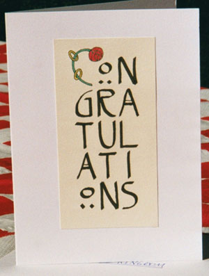
Back home, as the wedding day rapidly approached, I decided I must send a card, but what? I wanted to make one but what would it be? I recalled my visit and thought Calligraphy. Forming a block:
CON
GRA
TUL
ATI
ONS
"Illuminated" first letter, with some wedding-related image. I too got a book out of the library, with the usual calligraphic fonts, Gothic, Italic etc. But then I had a better idea -- CRM used a distinctive and elegant lettering style. Much more appropriate. After that I quickly decided that the illumination would include a CRM rose design but it took me a while to decide how best to incorporate it into the lettering. I considered winding a rose around the "C" or crossing through it and over the "O" and "N". Nothing really seemed to work, initial sketches looked odd and unbalanced. My final choice was to form the "C" with the stem of the rose and loop two rings around it like leaves.
I carefully drew up a grid of cells for the characters, in pencil, on a piece of art paper (measure twice, draw once). I made the first cell a little larger than the others. Then I inked-in the letters, freehand, and drew the initial letter, cut out the design and glued it onto a blank card. Happily, it worked out OK I think: