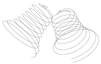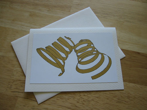
Being Creative: Kelly and Dave's Wedding Gift and Card
My friends Kelly and Dave got married in June 2003.
 The first version of "Dave".
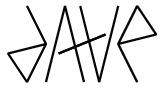 The second and final version.
Kelly's name was quite a bit harder. The double 'l' is so strong that the name wants to rotate about that point. That means the 'k' can map to the 'y' (relatively easily) but the 'e' is left without a counterpart. I spent a lot of time doodling with this. I only produced two designs, differing by their treatment of the 'e'. Initially, I had the 'e' floating between the 'l's, it was really only three horizontal lines (actually, a capital 'E'). I quite like
the look of it, it has a nice almost Asian feel, but the name wasn't as clear as I'd like. I was stuck on this design for a while, and I feared I'd never get anything good enough. That could've jepardised the whole project, but I at least convinced myself that if nothing else it could be treated as a "nice abstract design" (I imagined myself having to explain it to D&K). Eventually I did come up with an alternative design. This doesn't rotate about "ll". In fact their are two sets of 'l's, the idea is that the "other" set is the (double) vertical on the 'E'. The "feet" of the rotated 'L's become a single serif on the 'E'... Still a bit of a stretch I know, but I decided it was an improvement and to go ahead with the plate using it.
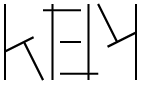 The first version of "Kelly".
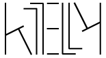 The second and final version.
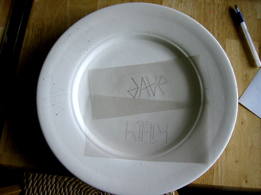
Happily, I found a "do-it-yourself" ceramics place quite close to me, in the Valley Fair Mall. I bought the plate ("14 inch charger", I think) and hired some paints (black for the lettering, red for my signature & date on the back and green because I thought I'd also put a "dishwasher safe" icon on the back, but later changed my mind -- it's just too big for a dishwasher!). Then the next challenge -- I pondered for quite a while how to transfer the design onto the plate. Trace it using carbon paper? Make a stencil and pencil it on? What I did in the end was write some PostScript (yet again) to render the designs (the images above). I then printed them, along with some extra lines for guidance, onto clear acetate sheets (for overhead projectors). At each line vertex I used my craft knife to drill a small hole. I glued two large sheets of paper together, inverted the plate onto it, drew around the plate and found its center. Then I used a protractor to find the 8 locations for the 4 "Dave"s and 4 "Kelly"s. I then put the plate back on the paper and transferred the 8 locations to the rim, then turned the plate upright again and began the laborious process of transferring the design. I used the guide lines on the acetate sheets to position each "Dave" and "Kelly" in turn and made a small dot with pen through the vertex holes onto the plate's surface. I then inked a straight line between the appropriate vertices to recreate the names (this is mostly why the 'd' in "Dave" is made of straight lines, easier that way). This gave me guide lines for the painting process. In the past, when I've done ceramics like this, I've used pencil to draw the design. However, this time the people running it claimed that presented a risk of lead poisoning!
Here's the plate just after I started transferring the design onto the plate, you can see my "templates" in the middle and faint outlines of the designs at around 9 and 10 o'clock.
Painting the lines took several hours. It was tricky, I wanted very precise lines but I'm just not that good. The final result has a definite "home made" look, which is perhaps not a bad thing. Overall though, I was rather pleased with it.
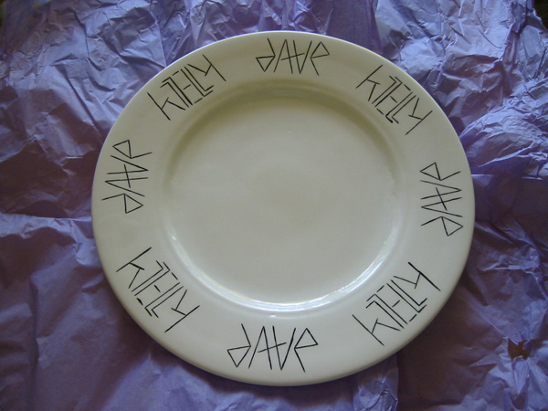
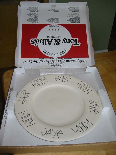
It is a big plate, I needed a reasonably large canvas to work on, but I hope Dave and Kelly can find a use for it!