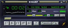
Winamp is a program for playing music on a PC -- MP3's, CD's etc, etc. Skins are "zipped" collections of files (mostly bitmaps) that allow you to customize the program's appearance. By default, it looks something like this:

I decided to try to make one with a "paper" theme, to match this site. Many hours into it, I thought of a little (3 by 4) font I'd made for a completely different project (a calendar application for the Palm Pilot, perhaps it'll show up
here eventually) and decided to make a much simpler, sparse skin, based around it:
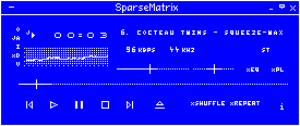
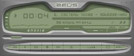
Still quite a lot of work (there are other windows to skin) but it turned out reasonably well I think. I describe it as "Sparse, semi-minimalist, peri-illegible & antithetical." It's not quite minimalist because, for example, I did things like making the numbers in the mini-font 5 pixels high instead of 4 (my arguement is that the letters are made clearer by the context but digits lack that advantage). It's nearly illegible (I find that you need a pretty good, crisp monitor to see things clearly). It is almost the antithesis of complex designs like this (although they are very cool):
Here are a few more SparseMatrix images:
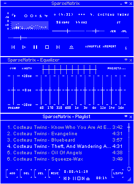 The Main, Equalizer and Playlist windows in full-size mode |
 ...and in Windowshade mode |
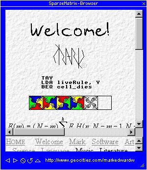 The minibrowser. |
You can download it here. It only got three stars and it hasn't had a lot of downloads :-)!
I learned a few hard lessons in doing this, my first skin. Here are some useful points that the example doesn't mention.
Also, I downloaded a WinZip add-on that provides command-line support for zipping. This let me write a .bat file to freshen the skin zip file then copy it to the .wsz file and install it -- made development must faster!