
Being Creative: Stamps from the Future

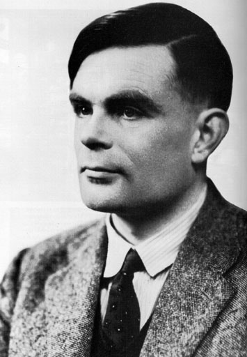
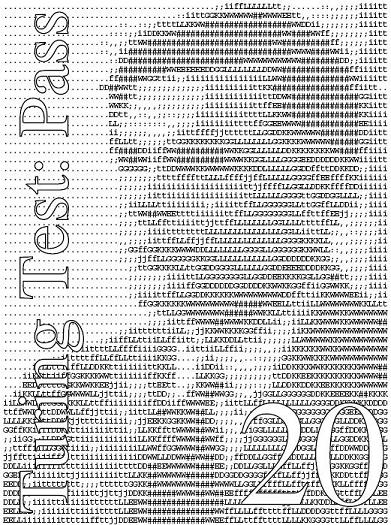
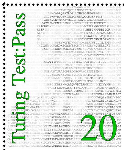
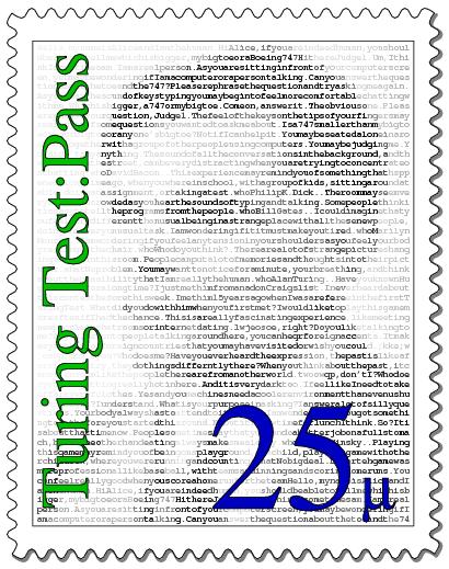
I modified my PostScript to "inject" the text of the conversation into the image instead of the random chars.
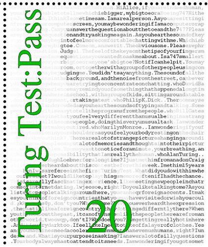
I can't remember what happened to the position of the "20" here.
Right from the start I decided not to put a year on the stamp, or any indication of country of origin. I also wanted to make the stamp's value neutral. I thought about omitting any kind of units, but I was also drawn to the idea of micro grams of gold, or μgAu. I thought about displaying this in full, but eventually decided to just go with the μ and to make the value 25. I want the stamp to be mysterious! At today's gold prices, 100μgAu is about a cent, but I imagine the price of gold will continue to increase!
Progress is being made, I'm starting to feel pretty good about the project. I am unhappy about those perforations though -- bad things happen when the rows intersect because they're not correlated at all. I decided to switch to the more modern style seen in self-adhesive stamps, the wavy lines. After some close inspection of real stamps, I started coding the "perfs" as a series of arcs but it soon became apparent that this approcah wasn't going to work, I needed spline-y goodness. I wrote some separate test code to work on it, eventually I had something I was happy with, including the special treatment of the ends:

With some final tweaking -- adding the μ and a little more colour, the stamp was finally done:
Woot! This emboldened me to go back to my original idea, and create the FTL stamp. I really wanted a simple clean "old-school" look for this one, basically monochrome and ideally with an engraved look. I started hacking, added the easy things first, "FTL/1" (FTL-1 just didn't look good) and 25μ. Then I had to start thinking about the composition... My immediate, not very imaginative thought, was "ship in bottom-left corner heading towards a constellation in the top right". So, constellations first. Centaurus (home of Alpha Centauri) is the obvious first choice, but the constellation itself looks like some random lines to me. So I chose the Big Dipper, which is instantly recognisable I think (but not a constellation, it's an asterism). I found a diagram, converted the star positions to grid coordinates and wrote some code to draw a scaled representation of it:
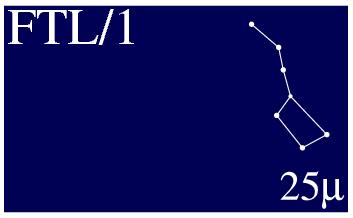
I decided to use a dark blue, rather than black. Next came the ship. Something simple, recognisable but hopefully a little mysterious. I wrote code to draw a simple cone, with some odd rings behind it. The propulsion system? The two elements just didn't look right, so I added a "portal" and then put the Big Dipper in an inset window, and highlighted a particular star.
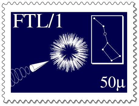
I should point out that I don't believe that supraluminal travel is possible. Also, I'm not at all optimisitic that we'll create an AI that can participate in a real conversation anytime soon. I do think there will probably be a place for stamps quite a long time into the future, even as email etc becomes more and more important. I keep thinking of postcards.
Both PostScript programs are about 1000 (somewhat messy) lines long. Turing source and pdf. FTL source and pdf.
I've done quite a few projects in PostScript. It has multiple appeals. It's programming, which is what I do as a job and it's a creative activity I generally enjoy. But PostScript is quite different from what I use at work, C++. PostScript is stack based and I sometimes have a hard time getting my head around it, especially complex expressions. It lets me make very intricate things, admittedly, only on paper, but I can be extraordinarily precise and refine things until I'm happy. I've lost count of how many iterations I went through on the stamps, slightly tweaking the look. The trouble with building something physical is that if it comes out wrong, it's not always easy to unscrew/unglue things, let alone undrill/uncut them!
There are more pictures in my flickr Make set.
This was featured on the Make blog.